#triggerwarning: If you aren’t using triggered e-mails, you’re leaving money on the table! Triggered and transactional emails are often overlooked by new companies because people tend to consider them as less important than making a good product or having a nice website and neat landing pages. However, these emails are the outer spin electrons of your marketing molecule — those emails are the everyday connection between your product and your audience. You may have to pay more attention to them, treat them gently. Good copy won’t be enough; you need a stunning design for these emails too because it’s the medium that new leads, users, or customers see first. 
Credit: Shutterstock
What are triggered (and transactional) emails?
Triggered emails are a subset of a larger group of marketing emails — those which are sent based on some kind of action. It implies some level of automation and preparation. These are NOT like emails that you write to your partners or clients on the fly. The trigger could be anything. The most used and common triggers are connected to payment services and purchases. We call this little group of triggered emails _transactional emails_. These are the messages you get after you order something on Amazon: a confirmation, a receipt, shipping updates, etc. There are many different things that could trigger an email. My favorites are the Welcome emails of freemium or free-trial offering startups. This is the moment when your website visitor became interested in your product and ready to try it. The welcome email is the first “real” and “personal” communication between a company and the new customer.
The open rates of triggered emails are so high because…
They are contextually and temporally relevant to the recipients. It’s about something they did and should be close enough in time that they remember it well. If the triggered email’s subject line is well-aligned with the context (triggering event), the probability of opening the email goes sky-high. Why? It’s purely a psychological matter — we are reinforcing our own decisions about things that we’ve already expressed interest in. The timing also a helping factor here: the email comes immediately or shortly after the event that triggered it — it helps the feeling that it is connected and important. So people tend to open these emails ~70% more often than any other kind. So what prevents you from using them? Hopefully, you’re already doing some kind of automation and sending triggered emails. Now I’ll help you to get the most out of them.
Timing and context matters when sending triggered emails
It’s true. Let’s examine closely my favorite triggered email scenario, the Welcome emails. You sign up to try a shiny new tool that will help you conquer the world by reducing your time doing some horrible busywork, let’s say ……….. (pick your least favorite task, I don’t want to insult anyone). The minute you enter the app you get a welcome email (it’s often coming from the CEO of the company). How does this email look? Boring. Why? Because most of the marketers think that a plain text email will look personal. Also, there is a legend that the plain text message will land in the Primary tab (which only applies to Gmail) or easily avoid the spam folder in other email clients. Does it really serve to get into the Personal inbox — the holy Primary tab — with your Welcome message? Do you want it to be read immediately? While you are thinking about the best way and time to send out the welcome email or any other triggered message, please remember this piece of advice: immediate messages could be nice, but please do not distract people from your own context with the connected triggered email. The worst case scenario coming from an old e-commerce tale, a webshop marketer had the idea to up-sell things in a triggered email followed by the initial webshop order offering a 20% coupon code. Timing was the only problem. They sent this email before the checkout had closed. The visitors of the webshop who had seen the incoming email and had opened it before the end of checkout easily applied the 20% code and bought their very first item for 20% percent less price… That was not good for the revenue of course. Timing is important but sadly, good timing alone is not enough.
The design is the delicacy you’ve been searching for
Delivery to the Personal inbox may not be the best for marketing and product related emails. People tend to delete messages that are sent to their Personal sanctuary, but then turn out to be marketing material. In the previous example, the Welcome message is surely marketing material, but everyone will see it. Then why does everyone try to deceive their leads and fresh customers with plain text designs? Your message might be better placed in the Updates or Promotions tab (in Gmail) or to the “Other” folder, however, it has to be exceptional to stand out amongst the others. You need a hilarious copy and/or stunning design. The branded design is a must-have, but a nice design or image that drives interest is clearly the first step. If the visuals are on brand, it leverages optical continuity, while any additional creative and eye-catching thing would do the job to pin down the reader of the email and entice them to read further. A well-designed layout, a flashy image, a funny GIF — all of these could serve your goals.
Inspiring ideas of well-designed triggered emails
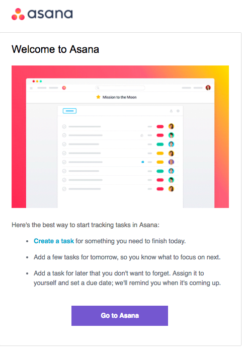
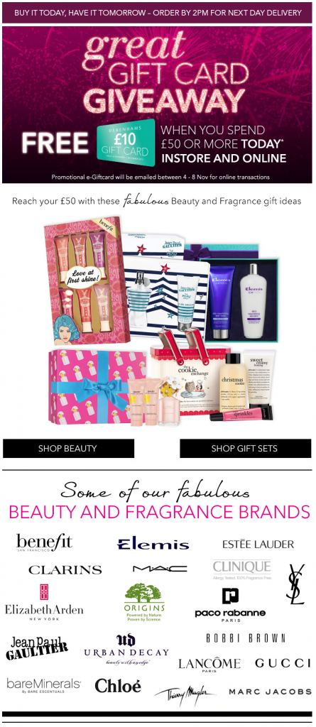
Let’s start with Asana and a traditional Welcome email, my favorite type. They decided to have a simple layout, with a simple picture and a really compelling button (CTA).  While they help in the onboarding, they redirect the readers to their mobile apps, with the same sort of app download Block that a wide variety of companies could use at the bottom of their messages. While I promised not to show any triggering event that is connected to payment or purchase, don’t think that you’ll get away without seeing some e-commerce examples. There are numerous opportunities to send triggered emails in the e-commerce world. Check out this example from Debenhams. They send this remarketing email when looking at one of their products without buying. Why? To help you remember them when you make the final choice.
  As you can see, this email is not the average, nearly plain-text, triggered an email. They sent a comprehensive email with a complex layout structure and different content blocks for different little goals. You may think, that the hardest part in an email like this is to set-up the automation, but in fact, the most time-consuming part was the email design itself.
Wrap-up
Fortunately, there are tools like Chamaileon.io that you can use for designing emails and templates, quickly and easily. With a drag-n-drop editor and ability to tweak complex elements, an email design like the above can be done in hours. To identify the right events you can use as triggers, I suggest talking with your colleagues and holding a brainstorming meeting.


