The trends in the web design industry are a snapshot of where the industry is precisely heading. The trends that the majority of the designers look up to every year should not just be a reference to be followed blindly. The challenge is instead to come up with amazing features and cutting-edge concepts, entailing creativity and innovation, that ensure users have a better website experience instead of just creating apps and sites that look similar. This is what the best designers in the industry, like this team of web designers Melbourne, will do to stay ahead of the game.
In the past few years, we have seen significant advancements in technology that have undoubtedly helped us connect with new users efficiently. Apart from building secure connections, the industry has also given us some new styles with an emphasis on documentation that have pushed the boundaries to make the web a more accessible and convenient environment for everybody. However, with so many developments in the web design industry, it is now time to slow down and look back at all the trends that will stick around in the subsequent times, so that even better websites could be launched in 2020.
Below are the top ten web design trends 2019 brought for our industry!

The web design, just like other industries in technology, is an ever-evolving field. Thus, designers, as well as developers, need to have their fingers on the pulse of what is trendy and what is expected to occur in the industry. Having said that, as we are about to close the door on 2019, here are some of the trends for your ease that will continue to direct in 2020.
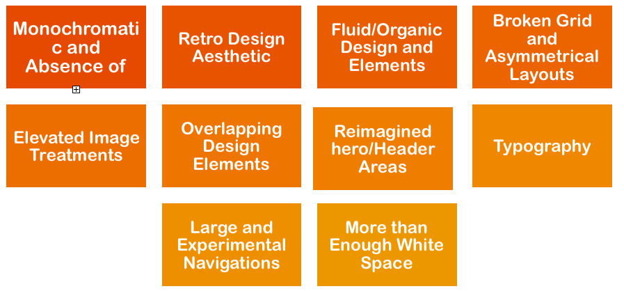
1. Monochromatic and Absence of Color:
Playing with a million colors is cool and fun, but what if you were limited to use one color or no color at all? Well, this might sound a little boring and not so creative, but if done well, the design constraint will not only enhance the overall design but also would be more memorable and easily identifiable.
The fact that you only have one color option for your design will give you a chance to solidify your branding by adding constraints in terms of the flexibility of design. There are many websites on the global web that have used more than two colors, and by using one color or no color at all, you have a great chance to stand out in the market.
Of course, it will be a daunting job to get the whole website done without adding more than one color or only keeping it black and white. But, if carefully thought and planned well, keeping in mind color-psychology, it can be the reason behind your brand’s success!
2. A Throwback to Retro Design Aesthetics:
The web design industry is just like fashion, as what is old suddenly becomes new and trending. As we have moved beyond the flat design where experimentation literally does not have limits, 2019 made us look back at the retro aesthetics with a hint of nostalgia.
All the designers and developers out there, here is the thing! Experimentation with nostalgia and the retro design can develop an exciting juxtaposition between then and now. What made 2019 an exciting year in this regard is that we saw more retro design styles reflecting time-cycles before websites were even accessible to everyone!
This certainly gives an idea of what we can expect to see – more of these retro-styled websites in the coming year with color schemes and typography that will make us think back to a different era.
3. Organic Design and Elements:
2019 has also taught us that slowly and gradually, we are pulling ourselves away from straight lines that come with a flat design, making the whole process boring and tedious. We have stepped into an era where experimenting with more shapes and lines has become a trend. All the forms that are not the typical straight-sided ones like the circle, rectangle, square, and triangle are called fluid shapes or organic shapes.
We are now accustomed to see these shapes replaced by elements drawn from nature, such as lakes, ponds, and types of forests. In the coming years, we expect to see web designers embracing a splash of natural elements in their designs, using the charm of mother nature to brighten up the screens.
4. Asymmetrical Layouts and Broken Grid:
The Broken Grid has been trending from the past few years and seems to prevail in the upcoming years as well.
In terms of design, the broken grid and asymmetrical layouts are imaginary planes with lines, both horizontal and vertical, that assist layout elements on the screen. Majority of the websites in 2019 had the grid positioned to the left side of the website. For instance, the title, content and logo design line up as the central part of a web design. In case of a broken grid, the items are pushed around on the plane in such a way that makes the layout look less rigid (or broken).
The broken grid design favoring unexpected pushing of boundaries has stuck in 2019 and is used as a technique to set your web design apart from the competitors. Let’s see if it continues to do wonders in 2020!
5. Elevated Image Treatments:
Images have undoubtedly given us various design opportunities when it comes to the web, and this is what we saw in 2019 as well. From graphics in a circle to making them colored (or black and white), designers have used all these techniques to draw attention and enhance the website UI/UX overall.
We not only came across websites that took the image treatment a step further by featuring a single and sizeable hero-style picture that took charge of the whole space of the site, but the year was also about shuffling up the way images were executed by cutting out the subject or adding a pattern on top. Looking at how successful these trends were in catching attention, all these techniques are likely to be more prominent in the industry in the following years.
6. Overlapping Design Elements:
Overlapping design elements can bring great visual appearance to web designs. Falling in line with asymmetrical layouts and broken grids, and making sure these do not touch each other and have their separate spaces, has worn out and become old-fashioned.
Yes, overlapping elements could cause confusion, and sometimes it will frustrate you when overlap in the wrong ways. However, 2019 showed us that if carefully done, the trend of overlapping all these elements on the web page can actually enhance the aesthetics of your site. In the next few years, we might also start more of experimenting with three-dimensional (3D) websites.
7. Header Areas or Reimagined Hero:
The “above the fold” area that often features a large image taking most of the space of the web design with a text on top is what catches attention at the very first glance. There was no experimentation with this area over the past few years, but 2019 changed it to some extent. Many of the websites started to push the boundaries and revised the content present along with minimizing the area comprising of the full-length image to grab the viewer’s attention in an efficient way.
8. Trends in Typography:
Pushing the boundaries of typography on the web is not as simple as it is in print. However, as coding has become more sophisticated in the past few years, experimenting with typography on the web has become a lot more natural.
The typography trends of 2019 were cutting or subtracting parts of words and letters, putting an image or photograph inside typography, animating the typography, and much more. Designers and developers can definitely benefit by keeping in mind this trend to come up with better web designs in the future.
9. Large and Experimental Navigations on the Web:
Navigation is one of the hardest elements that make up a web design. It is a daunting job, more of a challenge, to keep the web design appealing with functional aesthetics. 2019 was a year with a lot of experimentation when it came to navigation. Navigation was seemingly the focal point in web design this year as it occupied a considerable portion for the majority of the websites; instead of focusing on font size, placement on the page, and the layout only.
We can expect designers and developers to come up with even bigger navigations and website homepages in the coming years, or at least that is how sites can be made more sophisticated and alluring for the viewers.
10. White Space, More Than Enough:
The efficient usage of white space is one of the oldest tools in the web design industry. However, making this white space the focal point of attention is not as mainstream as it might sound!
While the white space used in an excessive manner was considered to be a symbol for wastage of space, 2019 has completely changed this idea. Now, it is looked at as a more critical part of the web design that not only enhances the overall looks but simultaneously makes it more noticeable for the viewers.
Need Help with your Web Design?
We live in an era where web design has completely taken over the industry, as even Disney is looking to create a good experience for its junior audience! However, designing the web is not as simple as it might seem. Though we have enough information about the trends in 2019 that can help you sketch a site of your own, we understand that there still is a need for expert opinion.
If you are looking for creative professionals from one of the best web design company, to assist you with your design ABCD, then UptownLogoDesign is the right place for it. Not only will the team of experts at Uptown help you with the basic designing, but you can also get your logos, apps, and other digital stuff crafted from them!


